An offering memorandum has to answer a buyer's first questions before anyone books a tour: where exactly is the parcel, how do customers and trucks get in, and what sits around it. A well-annotated drone aerial answers all three in a single image. For brokers marketing office, retail, industrial and land deals in Orlando, Tampa Bay, Austin and San Antonio, it is often the page investors study longest.
This post covers what an annotated aerial should show, how to plan the flight so the graphics work, and how to keep the labels accurate. It is about the OM page itself. For how to order and lead a gallery on listing platforms, see our guide to LoopNet, CoStar and Crexi listing photos.
What an annotated aerial should show
Most strong OM aerials carry the same handful of elements. Agree on them with your photographer before the drone goes up.
- The parcel boundary. A clean outline or tint on the subject property, so nobody has to guess where it starts and stops.
- Access. Curb cuts, signalized intersections, cross-access easements, dock entrances and the route a delivery truck would actually take.
- Frontage and visibility. Road names, the direction traffic flows, and where a pylon or monument sign sits.
- Anchors and demand drivers. Nearby tenants, hospitals, campuses, employment centers and highway interchanges, labeled only when they are really there and the broker has confirmed them.
- Distances or drive times. These come from the broker's own data or a mapping source, and the source should be noted. A photographer should never invent them.
The simple rule is that every label is a claim. A buyer's analyst will check each one against the survey, the plat and a map, so anything uncertain stays off the image.
Plan the flight around the annotation
Annotated aerials go wrong when the flight happens first and the graphics are forced onto whatever frames came back. Working in the other order saves a reshoot.
- Decide the labels first. Send a marked-up map, the survey or a site plan before the shoot, with the anchors and roads you want named.
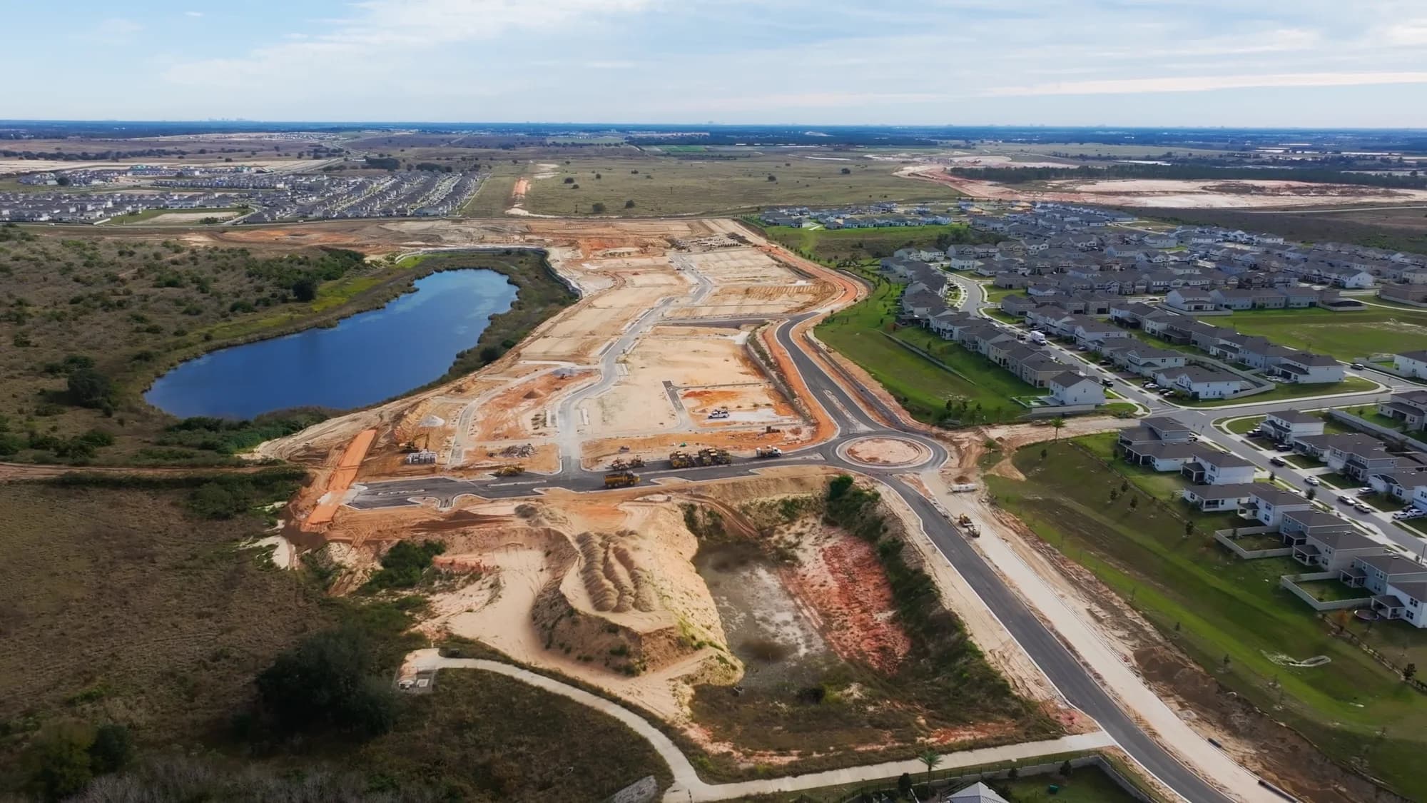
- Shoot both oblique and top-down. A three-quarter oblique toward the main road or anchor gives context and reads well on a cover. A straight-down frame is better for parcel lines, pad sites and site plans. Most OMs use both.
- Choose height by story. A higher frame fits the interchange and the anchors in one view. A lower frame shows the building, parking field and loading. The pilot works within the limits of their FAA Part 107 certificate and any airspace authorization the location needs, so share the address early.
- Leave room for text. Compose with some open sky or ground around the subject so labels and leader lines do not sit on top of buildings.
- Pick the light. A clear day with the sun on the main facade keeps parcel lines readable and avoids long shadows cutting across the site.
Parking lots deserve a thought too. An active retail lot tells a different story than an empty one at dawn. Shoot the property as it normally operates, and never stage traffic or cars to suggest activity that is not there.
Drawing parcel lines accurately
The boundary is the most checked element on the page, and the easiest to get slightly wrong.
- Use a real source. Draw from the survey or recorded plat where possible. County GIS layers are useful but approximate, so treat them as a starting point.
- Follow the ground plane. On an oblique image, the outline has to bend with perspective. On a top-down frame or an orthomosaic it is far simpler, which is one reason land deals lean on mapping. Our post on drone mapping for land developers covers when a full map is worth it.
- Add a short disclaimer. A line such as "Boundary lines are approximate and for illustration only" belongs on every annotated aerial.
- Keep the layers. Save the file with the graphics on separate layers so lines can be updated when a parcel is split, a pad sells or the listing changes.
Design choices that keep the page readable
An aerial with twenty labels reads like a road atlas. Restraint makes the subject property stand out.
- Use one strong color for the subject parcel, often the brokerage's brand color, and a neutral style for every other label.
- Keep labels to roughly six to ten per image, and use leader lines instead of text laid over roofs.
- Match fonts and colors to the rest of the OM so the aerial looks like part of the document, not a pasted-in graphic.
- Mark anything not yet built as "proposed" or "under construction". Never show a future project as if it already exists.
- Keep an unlabeled version. A listing hero, a print sign or an email header often reads better clean.
Where annotated aerials fit in the OM
A typical memorandum uses aerials in three places: a context image near the front that places the property in its market, a site page with the parcel outline and access, and a wider market overview showing the anchors and roads that drive demand. Developers often reuse the same set in lender and investor decks, which is covered in our post on what developers need from land to lease-up.
If the OM has a launch date, mention it when you book. Delivery timing is confirmed at booking, and the annotation round needs a little time for the broker to review labels before the file is final.
JRP flies and annotates commercial aerials across Central Florida and Central Texas, from single pad sites to multi-building parks. You can see the full range of work on our commercial real estate photography page. Ready to book? Call or text (689) 600-2131 or get in touch.