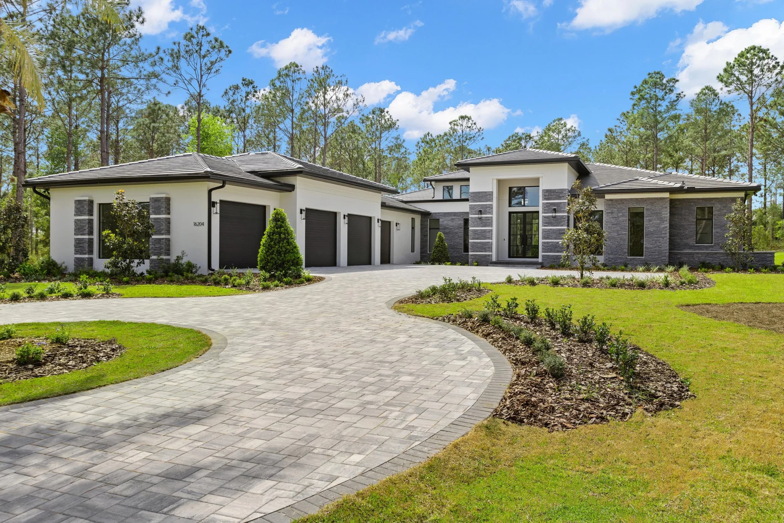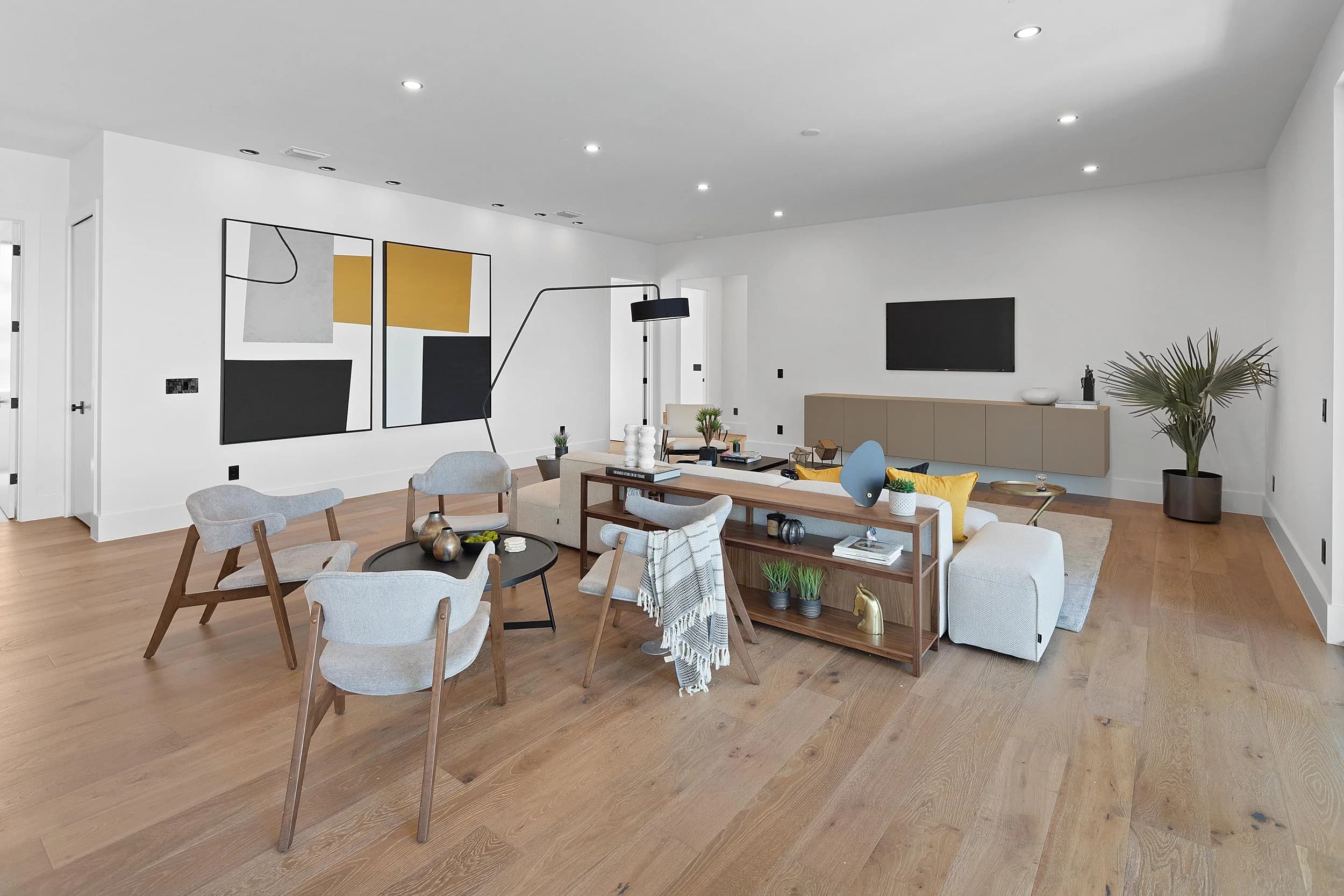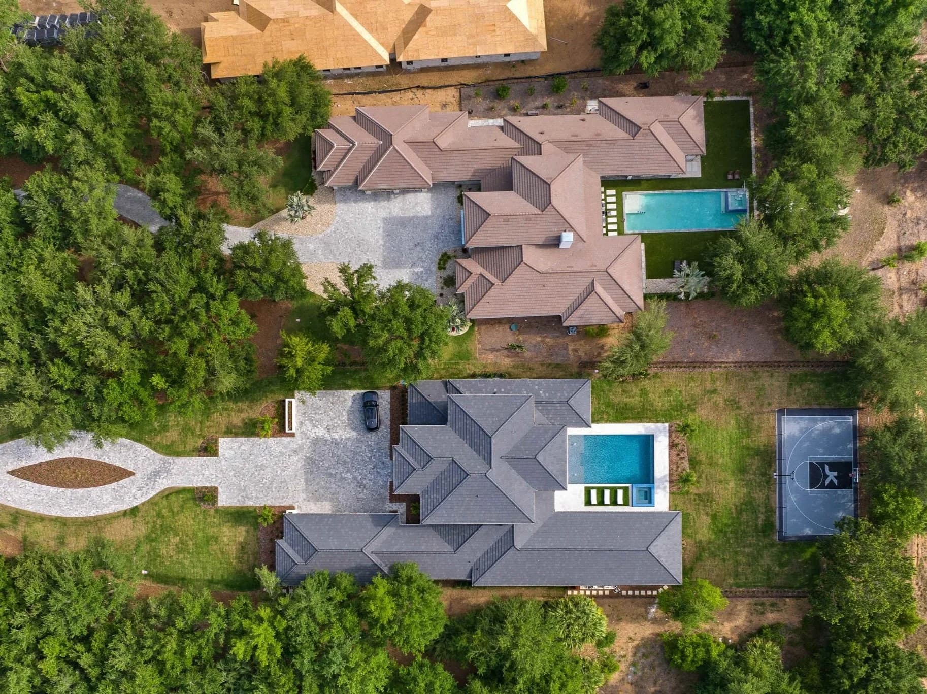
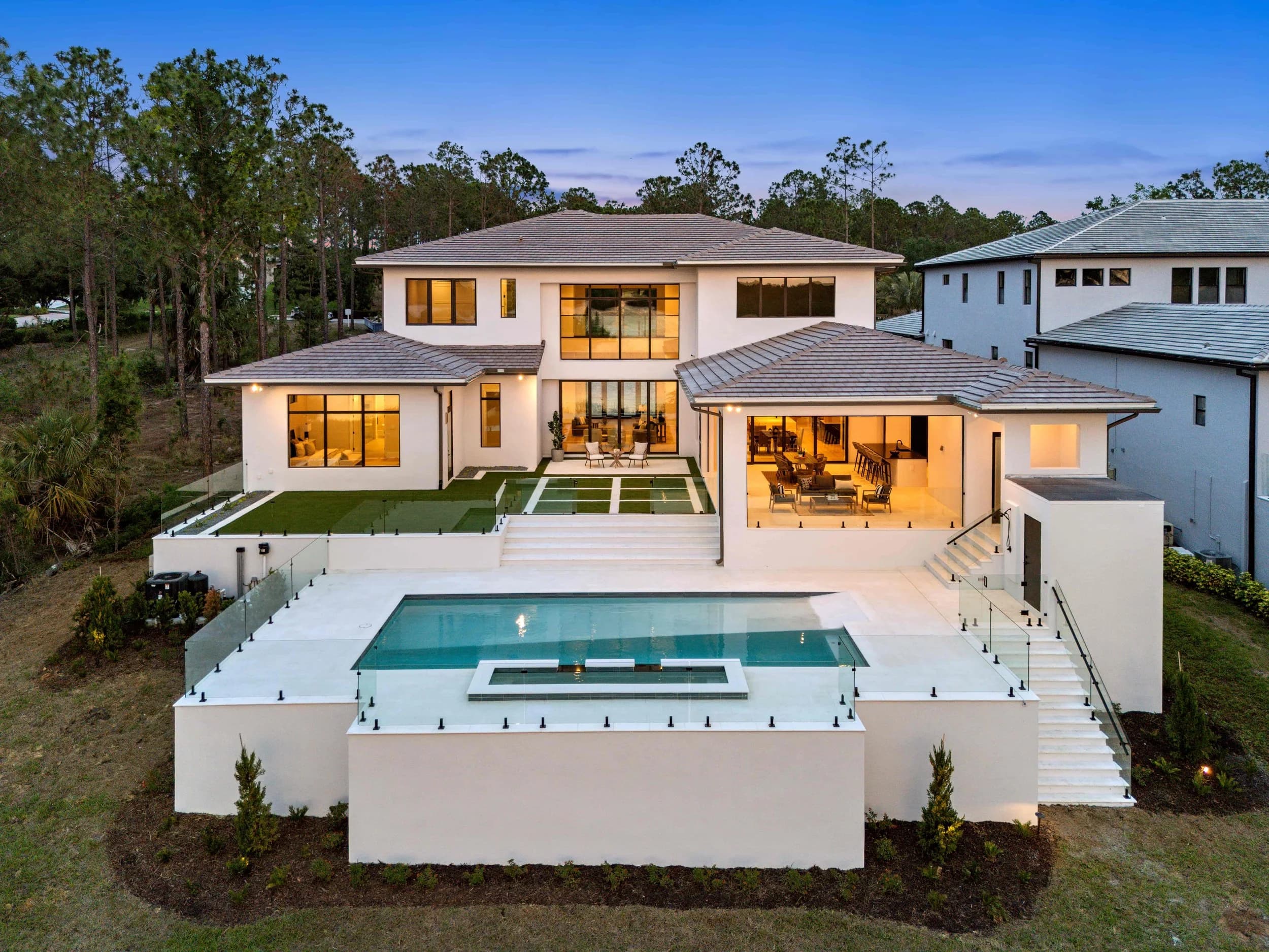
A builder's website is usually the most expensive marketing asset the company owns, and photography is the thing people come to it for. It is also, on most builder sites we look at, the thing making the site slow enough that a share of visitors leave before the photos finish loading.
This is a solvable problem, and solving it does not mean using worse images. It means handing the web team files that are built for the web.
Why Page Speed Is a Photography Problem
On a typical community or model home page, images and video are the overwhelming majority of the bytes the browser has to download. Everything else — the text, the layout, the fonts — is small by comparison.
That matters for two reasons. Search engines factor loading performance into rankings, so a slow gallery page competes worse for the community and floor plan searches builders care about. And prospective buyers on phones, often on cellular in a car outside a community, abandon pages that stall. A hero image that takes six seconds to appear has already cost you the visit.
The instinct is to solve this by shrinking images until they look bad. That is the wrong trade for a builder, whose entire pitch is visual quality. The right approach is to be deliberate about dimensions, formats, and what loads when.
Practical Specs to Hand Your Web Team
These are reasonable starting points for a builder site. A good developer will tune them, but having a defensible baseline stops the conversation from being a guess.
- Full-width hero images: around 2400 pixels wide is plenty for large desktop displays. Beyond that you are sending data no one can see.
- Gallery and lightbox images: roughly 1600 to 2000 pixels on the long edge.
- Cards, thumbnails, and grid tiles: 800 pixels or less on the long edge.
- Format: WebP or AVIF for display, with JPEG as a fallback. These commonly cut file size by a third to a half at the same visual quality.
- Responsive sets: ask for multiple sizes of each image so a phone downloads the phone version, not the desktop one. This is the single biggest win on most builder sites.
- Lazy loading: everything below the fold loads on scroll — except the main hero image, which should load immediately.
- Reserved dimensions: width and height attributes on every image so the page does not jump around as photos arrive.
Video Is Where Builder Sites Really Suffer
A self-hosted background video is the most common serious mistake we see. A full walkthrough or community film sitting directly on the page can dwarf every image on the site combined, and on mobile it often does not autoplay anyway.
A more workable approach:
- Host long-form video on a streaming platform that adapts quality to the viewer's connection, and embed it. That is what those platforms are built to do.
- If you want motion in the hero, use a short, silent, muted loop of a few seconds — heavily compressed and deliberately produced for that purpose, not a clip cut from the main film.
- Give every embedded video a real poster frame, chosen for impact. Most visitors will never press play, so the poster frame is functionally a photograph and should be treated like one.
- Do not autoplay video on mobile. It burns data, it rarely works, and it slows the page.
The Handoff That Prevents All of This
Most of these problems are created at handoff, when a photographer delivers print-resolution files and a web team uploads them directly because nobody said otherwise. The fix is agreeing on deliverables before the shoot.
A builder marketing team is usually best served by asking for three sets from the same shoot:
- Print and sales center set — full resolution, for brochures, signage, and large-format displays.
- Web set — sized and formatted to the specs above, ready to upload as delivered. The same set feeds a single-property landing page if a particular home warrants one.
- Social set — cropped to vertical and square, since a horizontal architectural frame cropped to a phone screen loses the composition.
Producing those at delivery is straightforward. Reconstructing them later, or having a web team batch-resize a few hundred images without a photographer's eye on the results, is where quality quietly disappears.
A Quick Way to Check Your Own Site
Open a community page on your phone, on cellular rather than office wifi, and count how long until the main image is fully sharp. Then scroll the gallery and watch whether images pop in late or shift the layout. You will learn more in two minutes than from a report.
If the answer is uncomfortable, the fix usually is not a rebuild. It is a properly prepared image set and a short list of instructions for whoever maintains the site — and it tends to make the photography look better, not worse, because correctly sized images are sharper on screen than oversized ones the browser has to squash.
We deliver web-ready sets alongside full-resolution files for our builder clients, and we are glad to talk through specs with your web team directly. Ready to book? Get in touch or call us — we serve Orlando, Tampa Bay, and Central Texas.