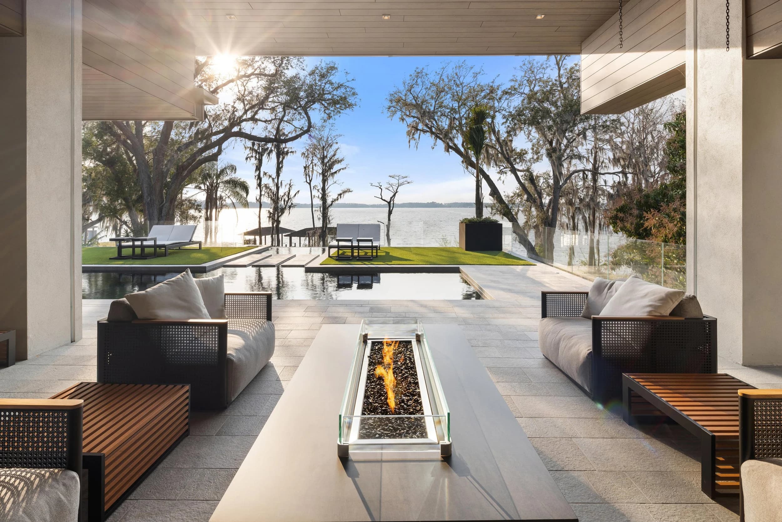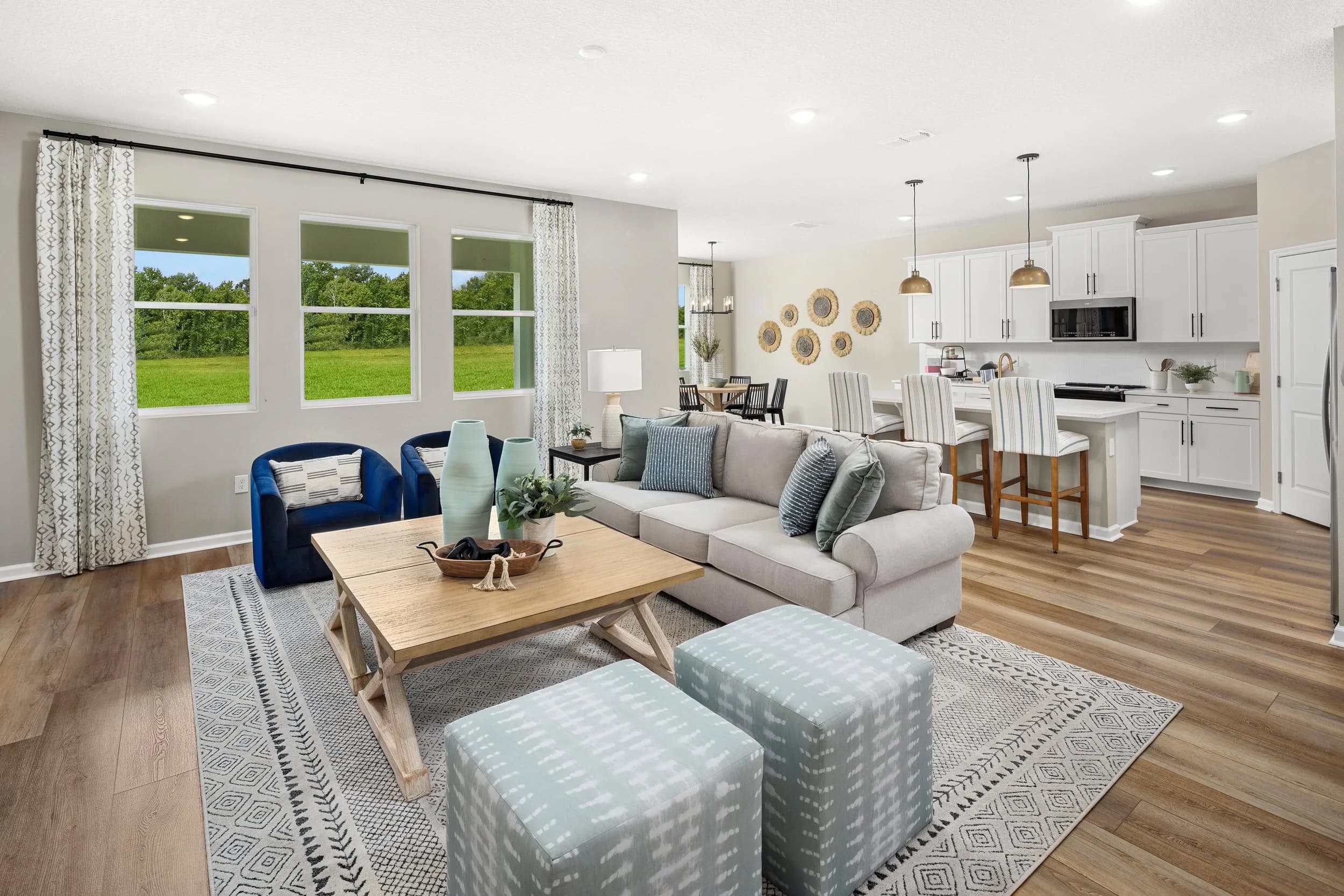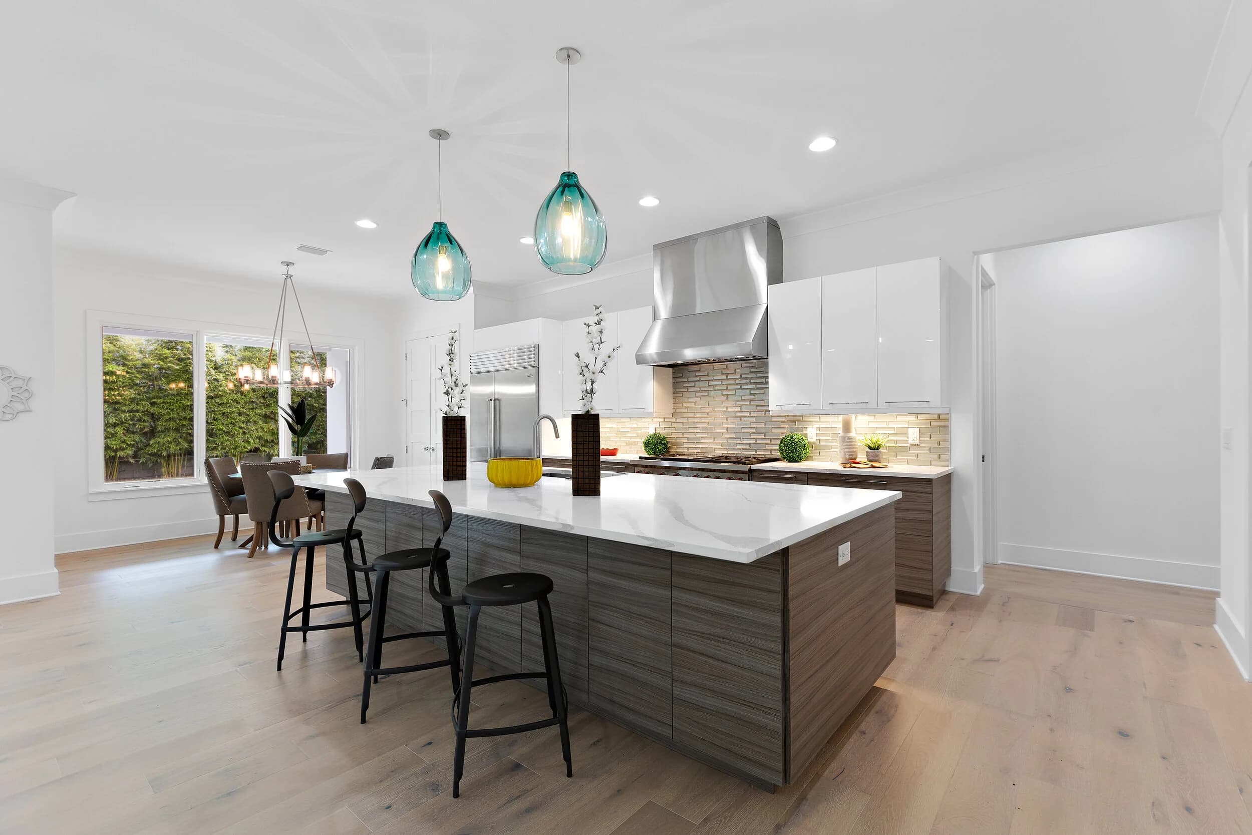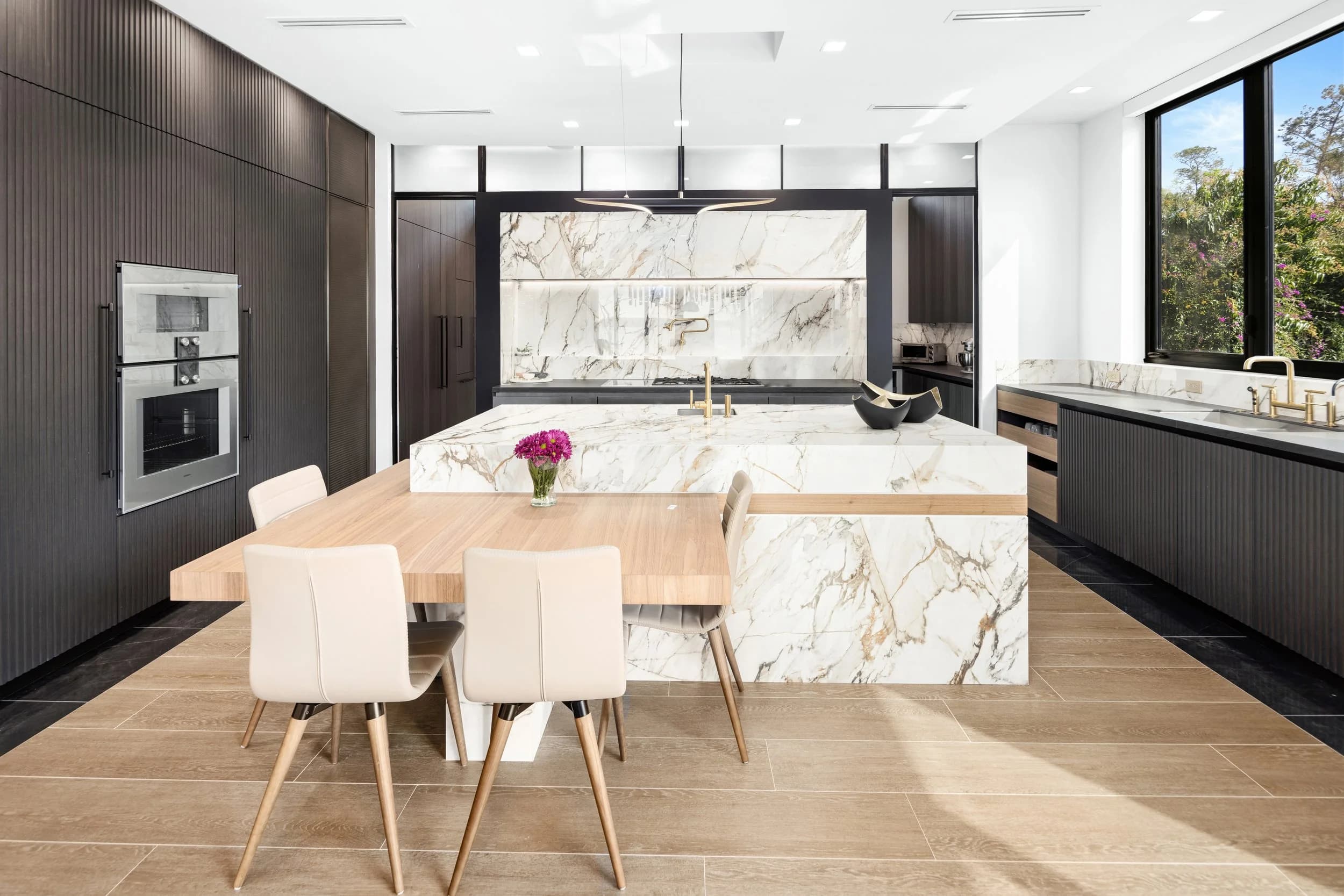
Black kitchens, charcoal accent walls, moody dens, and dark tile have moved from designer risk to mainstream choice. They also break most of the default assumptions built into a camera, and shooting them the same way you shoot a white-and-greige interior produces gray, muddy, disappointing results.
Why the Camera Fights a Dark Room
Camera meters are calibrated around the idea that an average scene averages out to a middle gray. Point a meter at a room where the cabinets are matte black, the island is soapstone, and the walls are deep green, and the meter concludes the scene is underexposed. It compensates by opening up.
The result is a photograph where the black cabinets are a flat charcoal, the deep green wall is a sage, and the point of the design is gone. The homeowner spent real money making a room feel intimate and the photo makes it look like a poorly lit rental.
Fixing it is straightforward once you know it is happening:
Work off the histogram, not the meter's opinion. In a genuinely dark room, the histogram should be weighted left. That is correct, not an error.
Dial in negative exposure compensation or shoot manual and set exposure from the highlights, letting the dark surfaces fall where they naturally sit.
Watch the highlight end, not the shadow end. Raw files hold far more recoverable detail in shadows than in clipped highlights, so protecting window light and specular hits on countertops matters more than protecting the blacks.
Ignore the rear screen. LCD brightness in a dim room makes everything look brighter than the file is.
Dynamic Range Is the Real Problem, Not Brightness
The difficulty in a dark interior is almost never the darkness. It is the distance between the darkest surface in the frame and the brightest, and that gap is punishing in Florida. A dark den in an Orlando home with a west-facing slider onto a screened lanai at 3 p.m. spans a range far beyond what a single exposure holds. Either the windows blow out to white paper or the room goes to mud.
The working answers:
Exposure bracketing and blending. Multiple frames from one tripod position, combined so window views hold detail and interior shadows keep structure. Done well it looks like nothing was done at all.
Flash-ambient blending. Adding controlled light to interior surfaces so the room can be exposed closer to window level, without overriding the room's own character.
Timing the shoot. Scheduling a dark, window-heavy room for when the sun is off that facade removes the problem instead of solving it, and it costs nothing.
Fighting flare. Bright windows in a dark room produce veiling glare that lifts blacks into gray across the whole frame. A clean front element, a lens hood, and no cheap stacked filters preserve contrast that editing cannot recover.
Why Flash Alone Flattens a Moody Room
The instinct with a dark room is to add light until it is not dark anymore. That works, and it destroys the room.
A dark interior reads as intentional because of falloff. Light drops across a black cabinet run, a lamp pools on a rug, a fireplace wall stays in shadow. That gradient is the mood. On-camera flash produces flat frontal light with almost no falloff, so every surface gets the same amount of light and the room becomes an evenly gray box.
Better approaches keep the ambient in charge:
Ambient-dominant exposures where flash fills shadows just enough to hold texture rather than defining the lighting.
Off-camera lights bounced into ceilings or side walls, preserving direction and letting shadows stay where the room's own lighting put them.
Raking light across texture. Light skimming along a fluted panel, a black tile backsplash, or a wire-brushed oak floor reveals the material. Light fired straight at it hides the material entirely.
Respecting sheen. Matte black absorbs light and shows almost no specular highlight, so it needs texture from angle. Satin and gloss black show reflections instead, so the job becomes controlling what is reflected.
Dark walls also bounce color. A navy den tints the ceiling blue and a deep green room casts onto white trim. Those casts need correcting selectively rather than with one global white balance move.
Keeping Blacks Black Without Losing the Detail
The finished photo should have true black somewhere in it. A frame with no true black looks hazy and cheap.
The specifics that matter in editing:
Set an actual black point. Something in the image should reach or approach zero. Without it, the frame reads as fogged.
Lift shadows selectively, not globally. A general shadow lift raises the entire dark end and washes out the design. Targeted recovery on cabinet faces or a stair rail keeps the room dark while keeping the millwork readable.
Preserve separation between similar darks. Black cabinets against a black countertop against dark flooring can merge into one shape. Local contrast adjustments let the eye read where one surface ends and another begins.
Watch for noise. Shadow recovery amplifies noise, which argues for base ISO and a tripod rather than pushing files afterward.
Check on a bright screen. Editing dark interiors on a dim display produces images that look correct in the studio and unreadable on a laptop in a sunlit office.
When to Embrace the Mood and When to Brighten for MLS
These are two different jobs, and most listings need both.
MLS thumbnails are small, viewed quickly, often on a phone in daylight. A very dark thumbnail does not read at that size and will lose clicks against brighter competition. That argues for the lead image and the primary room shots sitting on the brighter, cleaner side of correct.
Deeper in the gallery, and in video, Matterport, and the property website, there is room for the shot that shows what the space feels like at night with the sconces on. Luxury vacation rental owners and interior designers usually want more of this than a standard listing does, because their audience is buying an experience rather than square footage.
The practical split is to keep the hero image and the first several MLS photos bright enough to read at thumbnail size, and let the moodier frames live in the back half of the gallery. Avoid a set where the treatment swings unpredictably from image to image.
Seller Prep for Dark Interiors
Match your bulbs. Mixed 2700K and 4000K bulbs in one room create color casts that are far harder to fix against dark paint than against white.
Dust matte surfaces. Matte black shows dust in a way no other finish does.
Wipe fingerprints from dark cabinet fronts, hardware, and appliance panels.
Turn on every lamp and undercabinet light, and replace anything burned out before the shoot.
Squeegee or dry-buff dark floors and tile, where streaks and water spots are far more visible than on light surfaces.
Ready to book? Get in touch or call us — we serve Orlando, Tampa Bay, and Central Texas.